Wo Hui Mandarin by Dulwich College International
Wo Hui Mandarin by Dulwich College International
One of the greatest impediments to uptake of learning Chinese to foreigners are ‘tones’ – you can say the same sound in 4 different ways and it means something completely different. It feels like a pointless complication, designed to make the language more difficult and inaccessible.
In fact, tones allow you to recycle each sound 4 times rather than constantly having to create new sounds. As a result, Chinese only needs 10% of the sounds that English does to make the same number of words. In other words, tones make Chinese simpler not more complicated.

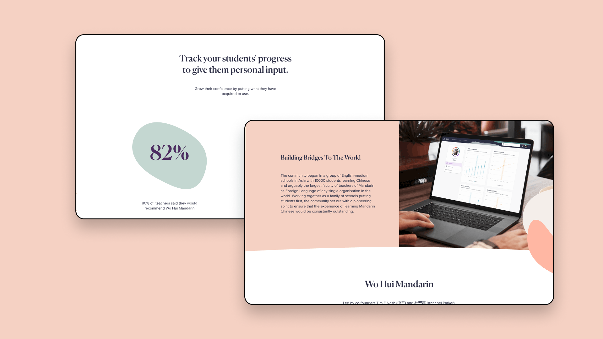
But how do you shift peoples’ mindsets when a belief is so commonly held? Well you need a method of teaching Chinese which is effective, and backs up the claims of simplicity. And in Wo Hui Mandarin, Dulwich College International have developed a pedagogical approach using the application of technology intended to not only transform the teaching and learning of Mandarin, but that of schools-based education in the 21st century more generally.
But you also need a brand which supports and illustrates your commitment to innovation. A visual identity which combats fear and builds bridges with a wide audience.

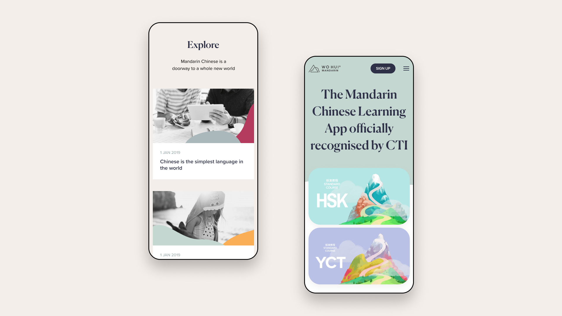
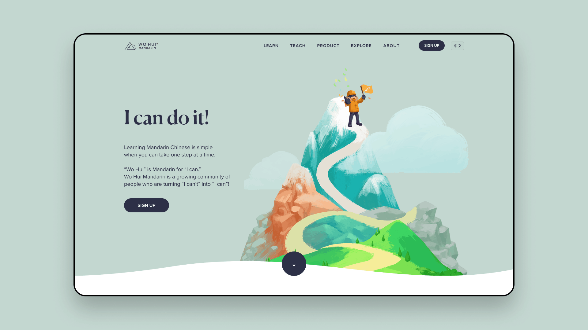
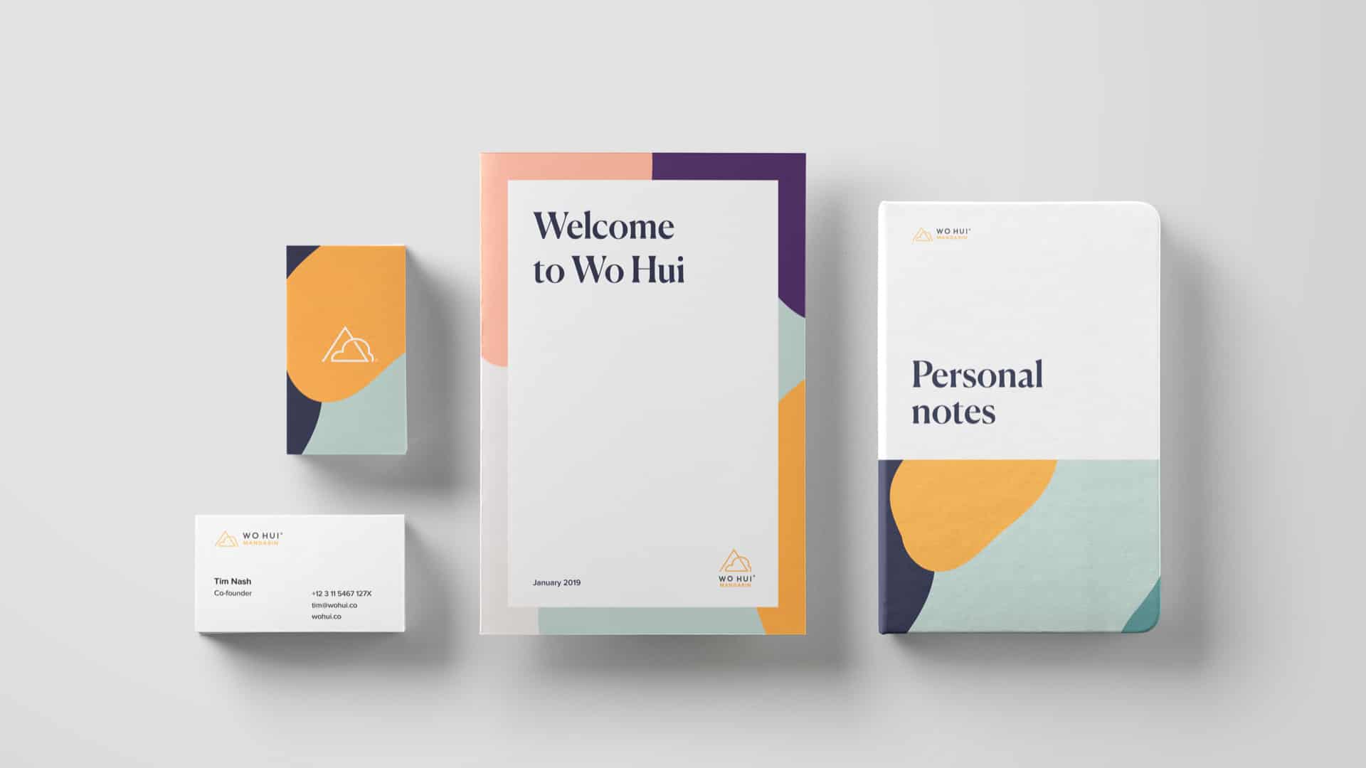
A key visual element in Wo Hui’s identity are patterns based on the clouds within the logo. Drawn from the concept of demystifying, they illustrate the learning journey and the language becoming progressively clearer, like clouds parting. To create a dynamic identity these patterns can be cropped, rotated and picked apart, creating endless ways of applying them. This almost infinite number of combinations in which the clouds can be applied hints at how the Chinese language itself works. Clouds are suggestive of both traditional China and new technology. While Wo Hui is relatively new, its parent – Dulwich College – was founded some 400 years ago in England. Similarly, the Chinese language is at something of a nexus with both ancient wisdom and modernisation being active forces upon it. The visual identity is designed to hold new, cutting edge thinking and applications in balance with the inherent knowledge of Dulwich College, its people, and of the Chinese language itself.

We are thought leaders of our industry, constantly finding new perspectives and challenging the old ways. By looking for the common human logic and connection, we disrupt how things are done. Although we always carry the highest academic credibility we never get lost in fancy words, we deliver actual results.

Want to talk Branding or Custom WordPress development ?

Jacob Säwensten - Brand & UX Designer
Get in touch →